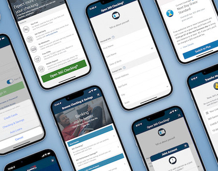
Mobile-First can start with the web
Redesigning the website was a massive effort done in collaboration with the Enterprise Site team, our Marketing, and Brand partners. Our product design team was the first to redesign our line-of-business webpages and contribute a product-specific addition to the component library.
Problem:
The majority of customers were doing their banking online and in branches. How to help those who may be hesitant about banking on their phone, to get comfortable with the mobile experience before they even download the app or open an account?
Solution:
Bring the features and functionality of the mobile experience to the web and let users see what the actual interface of the app looks like and does.
Results:
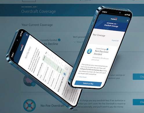
The responsive component increased downloads of the app originating from the website, and the alternate variants gave our marketing partners and other product teams a powerful way to let customers know exactly what to expect when they did download the app.
As designers, we actually had two customers here:
While the experience needed to create a convincing case for the features of the mobile app, the solution had to be easily manageable by the marketing teams. Given the multi-image nature of the animated presentation, the work required a lot of coordination in understanding the CMS and the processes that our marketing partners needed to follow to keep the images updated.
Months of PArtnering and User Testing:
We were fortunate to be able to partner with the Enterprise Site team to leverage the new design system and to be able to create nifty new components like the one above. This work took months of back and forth between the teams, making sure that the designs we were proposing would fit within the bounds of the system…and that it would meet the needs of our partners in other product teams for promoting the features they needed to highlight as well.
A key part of vetting the concepts included running proposed design options through user testing to ensure that the designs were helpful to the user, easy to understand. And we worked with our accessibility partners to ensure that the proposed solutions met or exceeded the necessary standards.
Motion Can Make a Difference
Another key contribution our mighty product team made to the forward-facing website was the addition of subtle animations to the product icons.
We redesigned THE Checking Page
just in time for the FIrst national AD campaign LAUNCH
Promoting Checking Accounts and the Mobile App
Promoting Checking Accounts and the Mobile App
Our product design team was the first to design and build a new product page on the site leveraging the new design system (and a couple of the new components that we created). Our Enterprise Site design partners had made giant strides in creating an entirely new and modernized design system, the bank pages had yet to be modernized. Fortunately, I and my team had played a role in the design of key site-wide elements like main navigation and benefits features by participating in the many co-creation sessions that our partners invited line of business product teams to. And as a lane lead, I was also part of the director+ planning group that met monthly to discuss, review and approve the Content Management System and build book components, so I was very familiar with the overall language and system.
Problem:
The previous page was focused on rates and while being very copy-heavy, it did not make a compelling case for the mobile banking features that were being touted in the new national advertising.
SOLUTION:
Redesign with a human-friendly focus on features and mobile benefits, and make it easier for customers to actually open an account by anchoring the CTA/button at an ever-present position at the top of the scrolling page.
ReSULTS:
The landing page redesign made a visibly and measurably impactful difference, crushing it by most measures including time on page and more importantly, conversions. The sub-nav also provides the marketing team with insights on what potential customers are interested in
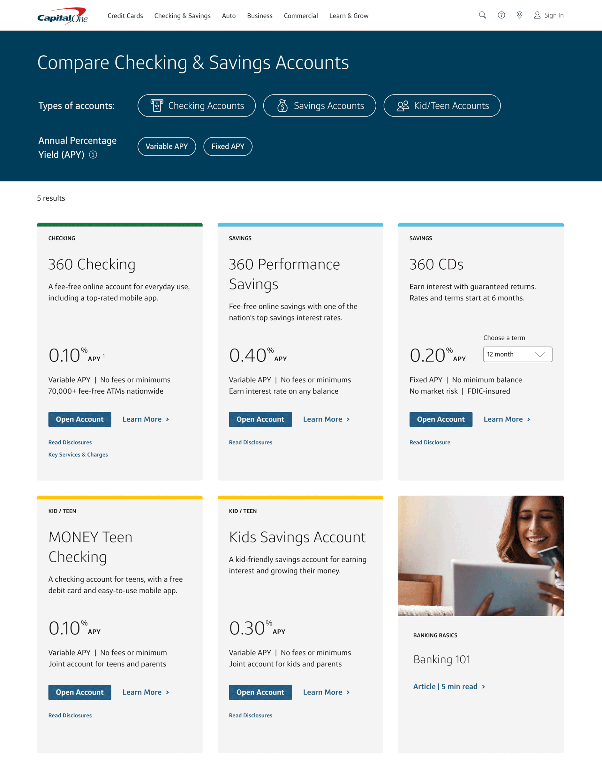
Making product selection a more enjoyable and helpful experience
Problem:
Before our "ShopX" Design team arrived, the product selection process entailed clicking through a series of tabs, or picking from a list to learn more and then returning to the list to choose another—a very tedious process indeed.
Solution:
Bring the "card-style" component from within the authenticated app experience, to the forward-facing web experience and allow customers to sort through options with a simple click or two—giving them the ability to find what they need quickly and easily.